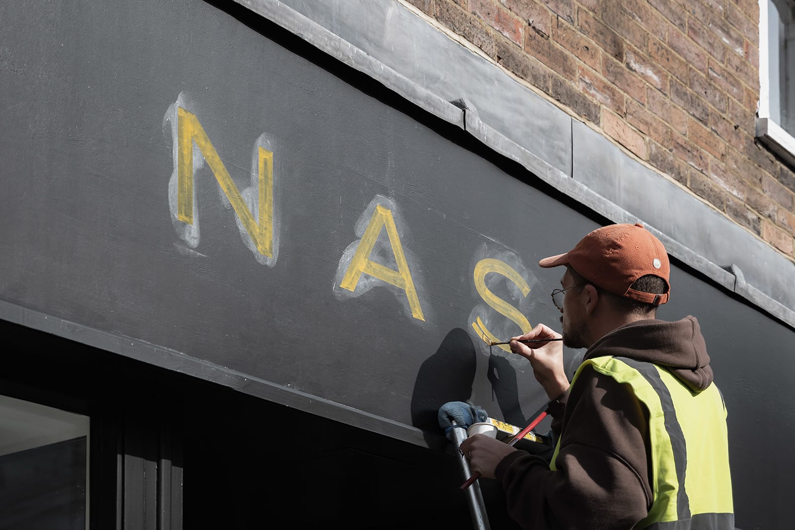


As we approach our 30th year in business, we are delighted to unveil a refined visual identity - an evolution in form and tone that speaks not only to our heritage, but to the property market we work in today.
We are the property people who move differently.
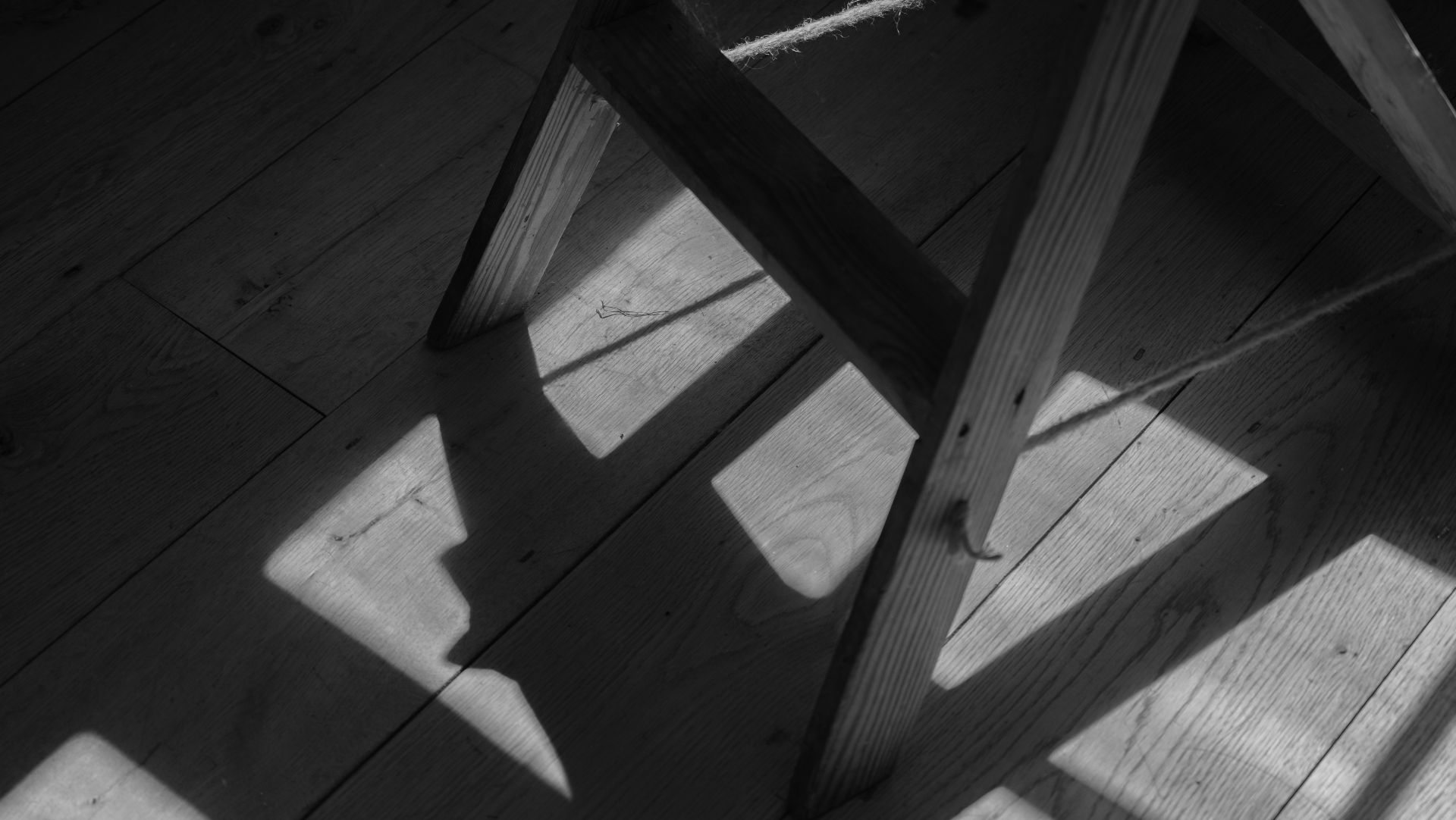
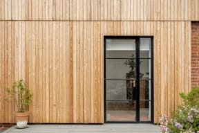
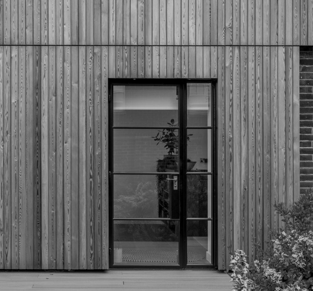
For nearly three decades, we’ve quietly cultivated a portfolio of beautiful homes that prioritise individuality over conformity. From 17th-century thatched cottages to crisp, contemporary builds, we champion properties with personality; spaces that tell a story, that resonate with craft and character.
So we asked our creative partners for something simple, sophisticated and, crucially, timeless. Something equally at home on the coffee table of a Georgian townhouse, a converted barn, or a minimalist new-build, without ever feeling out of place.
The resulting palette, inspired by the muted tones of Farrow & Ball, is an ode to the subtle colours of the English landscape: chalky clay, a rich barely-black and the muted tones of nature. These tones are both classic and contemporary. Clean, yet textured.
Because, while we trade in bricks and mortar, our work is grounded in something more elusive: feeling. This new chapter in our visual identity reflects that ethos. Understated yet expert, our new branding is less a reinvention than a considered refinement. It’s a design-led framework that allows the homes we represent to take centre stage; branding that accompanies, rather than competes.
But our new identity is more than cosmetic. It marks a deepening of our commitment to the clients we serve, and to the homes we are privileged to represent across Hertfordshire, Buckinghamshire and South Bedfordshire. Our marketing is led not by trend, but by tactility, storytelling and presence. In a world where scrolling at home has replaced strolling the streets from estate agent to estate agent, we meet our audience across the platforms that matter – digital, editorial and social – without ever losing our sense of place.
The homes we continue to look after are defined not by price, but by presence. And our new branding – elegant, quiet, thoughtful – is designed to reflect that perfectly.
This is Nash. Still independent. Still local. Still resolutely design-led. Just with a fresh coat of paint.